Rachelle Fisher
Strategic Brand & Package Design
Cream Cheese Spreads
What started out as a two month sprint resulted in the #2 selling cream cheese brand behind Philadelphia. We knew we were facing Goliath, and as the lead designer I knew the strength of Tillamook’s Brand would prevail on shelf if we embraced bright color floods. The “sea of gray” Philly packaging paled in comparison to bright turquoise, orange or red, and when I saw it in a shelf test I knew we had a winner. It might be the bright packaging that provided strength for Tillamook to go up against Philly, but package design can’t get all the credit here. Try it for yourself and you’ll see – it’s what cream cheese should taste like.
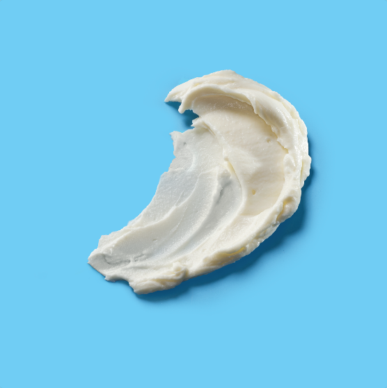
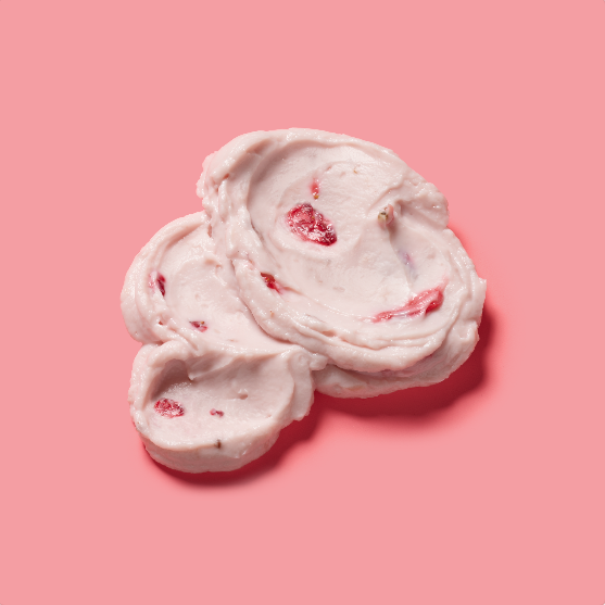
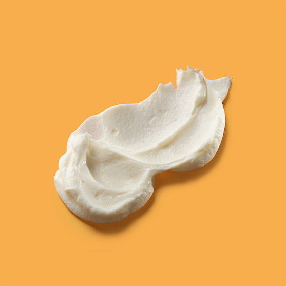
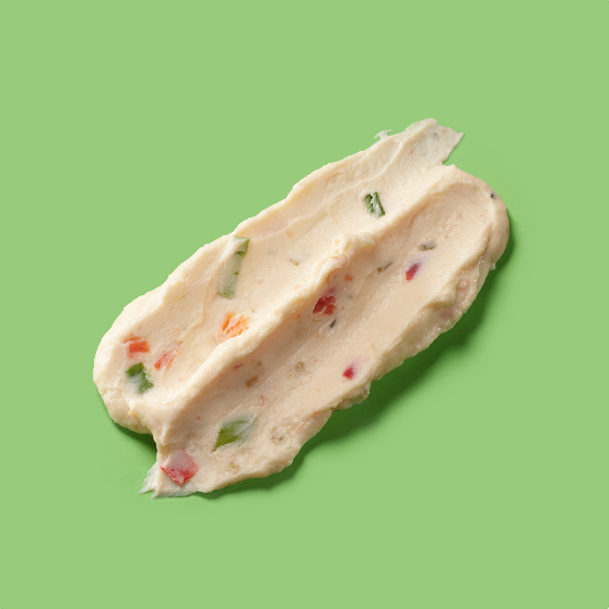
To show off spreadability and creaminess, each package features a stylized ‘schmear’, helping one flavor stand apart from the next. Front of pack photography by Maren Caruso
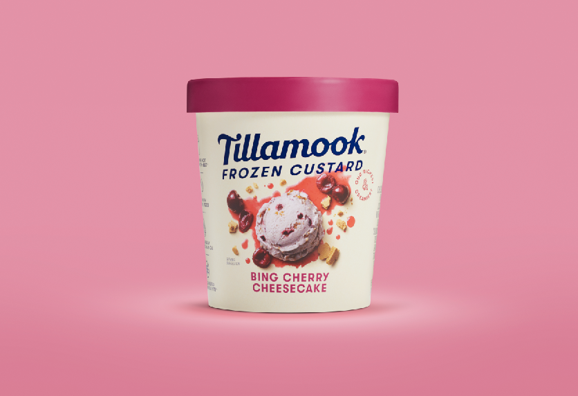
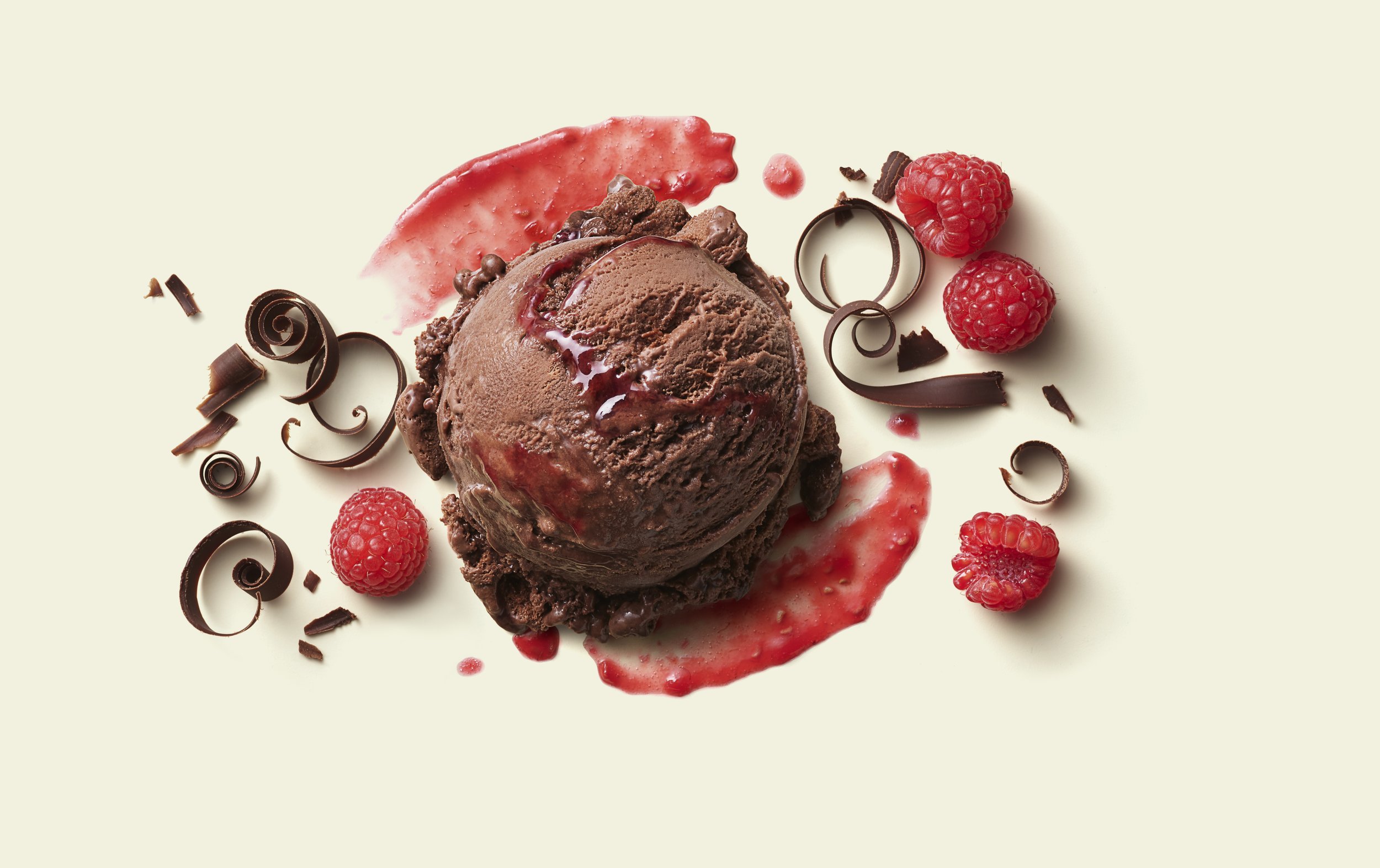
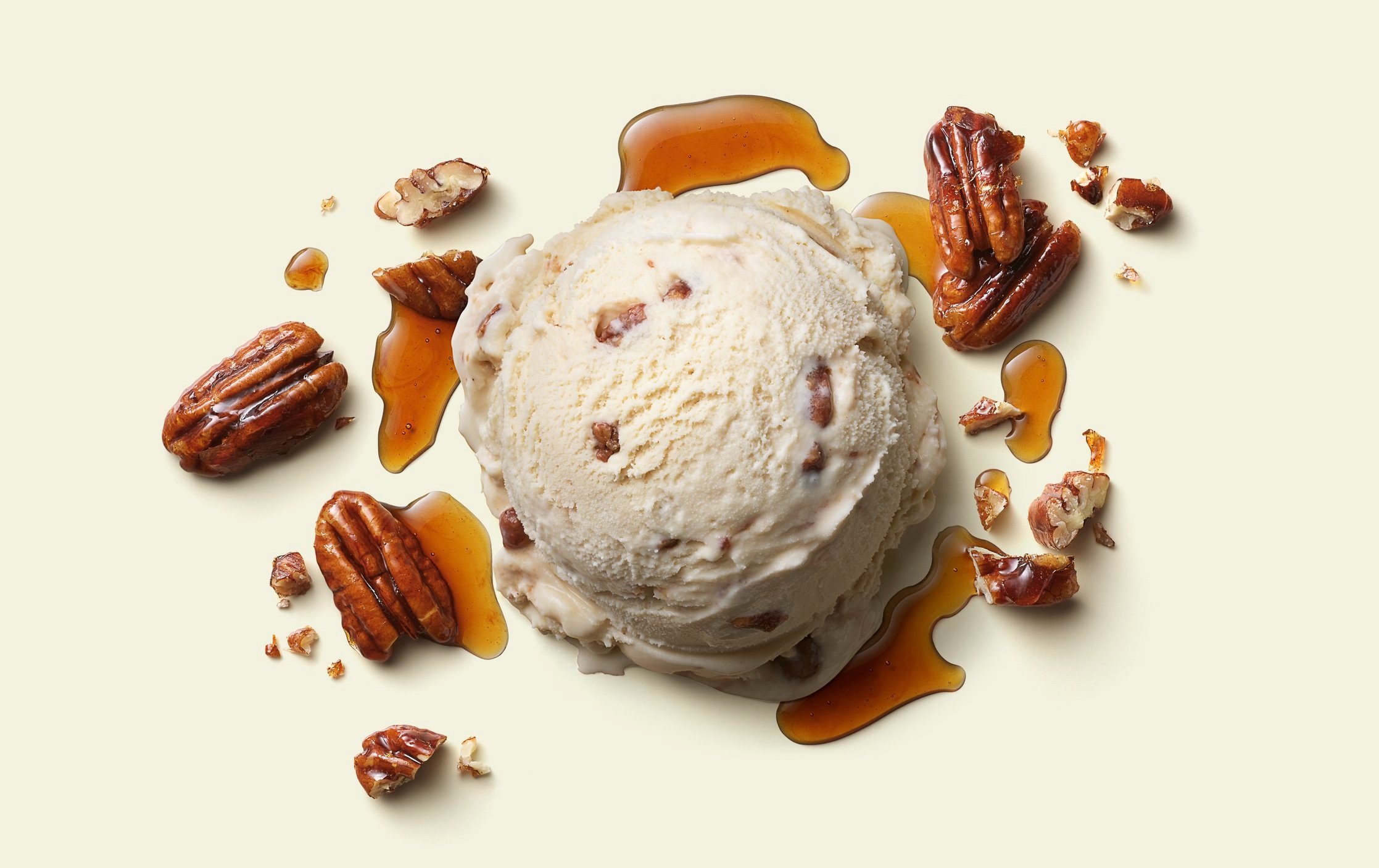
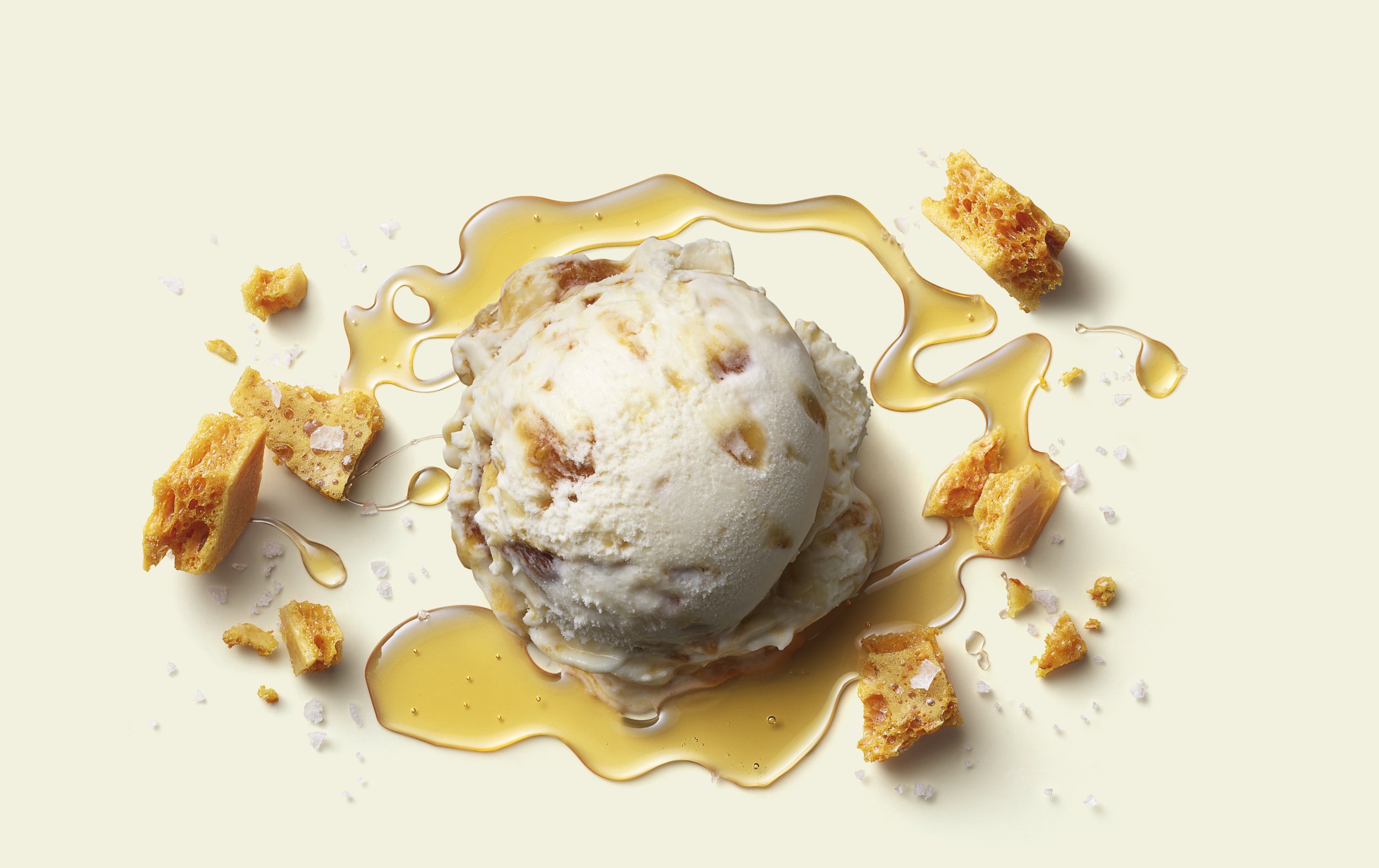
Limited Edition ice cream
In order to signal scarcity and limited availability, we needed a different design for seasonal flavors than our core flavors. Finding ways to alter the essence of our packaging design structure without compromising our Brand and the overall aesthetic of our ice cream cartons was getting increasingly challenging as we introduced more and more products to our portfolio. The solution was to keep the integrity of the system without straying too far, or we would risk consumers thinking we were introducing a new ice cream product itself, not just a seasonal flavor.

