• Work
  • Art
  • About
  • Contact

Rachelle Fisher

Strategic Brand & Package Design

  • Work
  • Art
  • About
  • Contact

Umpqua Rebrand

Design & Art Direction

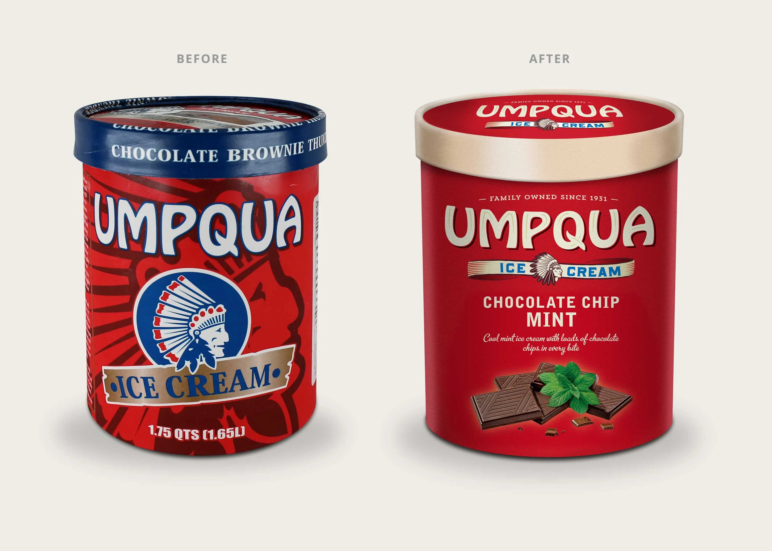
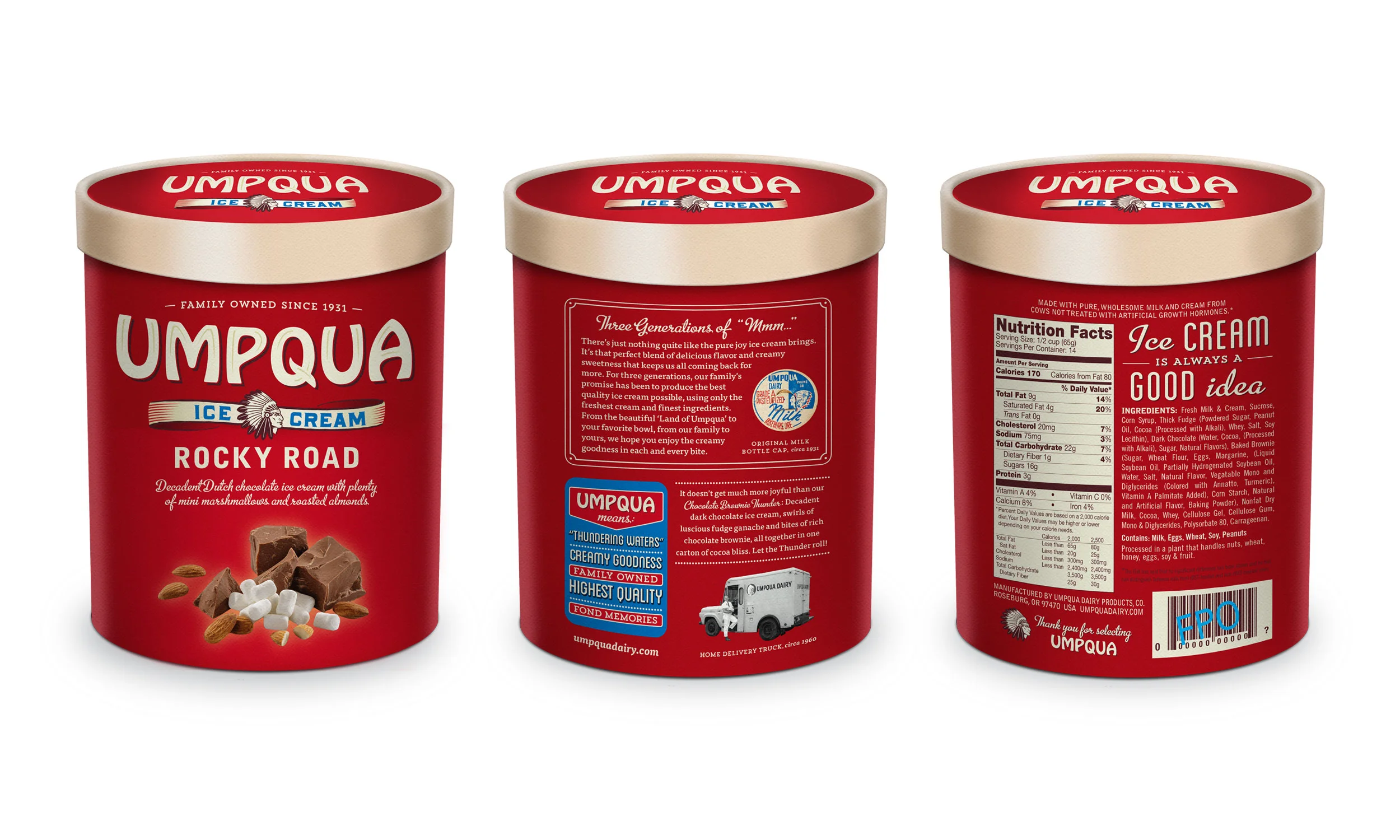
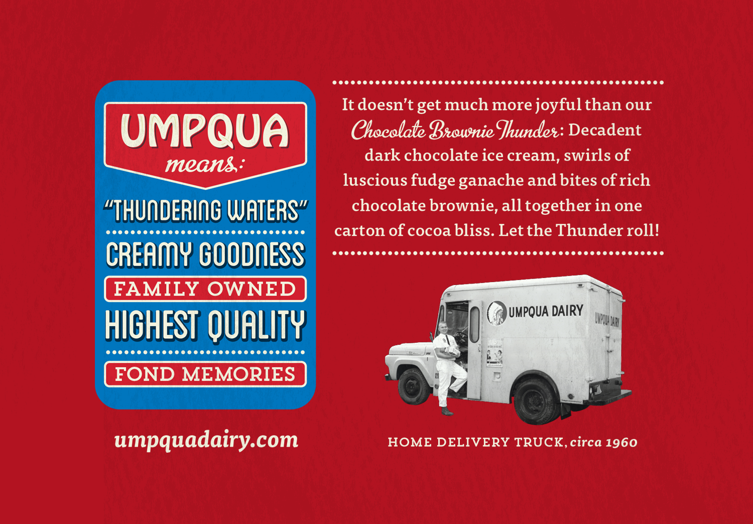
Objective: Update 40 year-old packaging to remain competitive in today's market. The challenge was to keep the Indian icon (blessed by the Umpqua Tribe), Hobo font and red packaging.

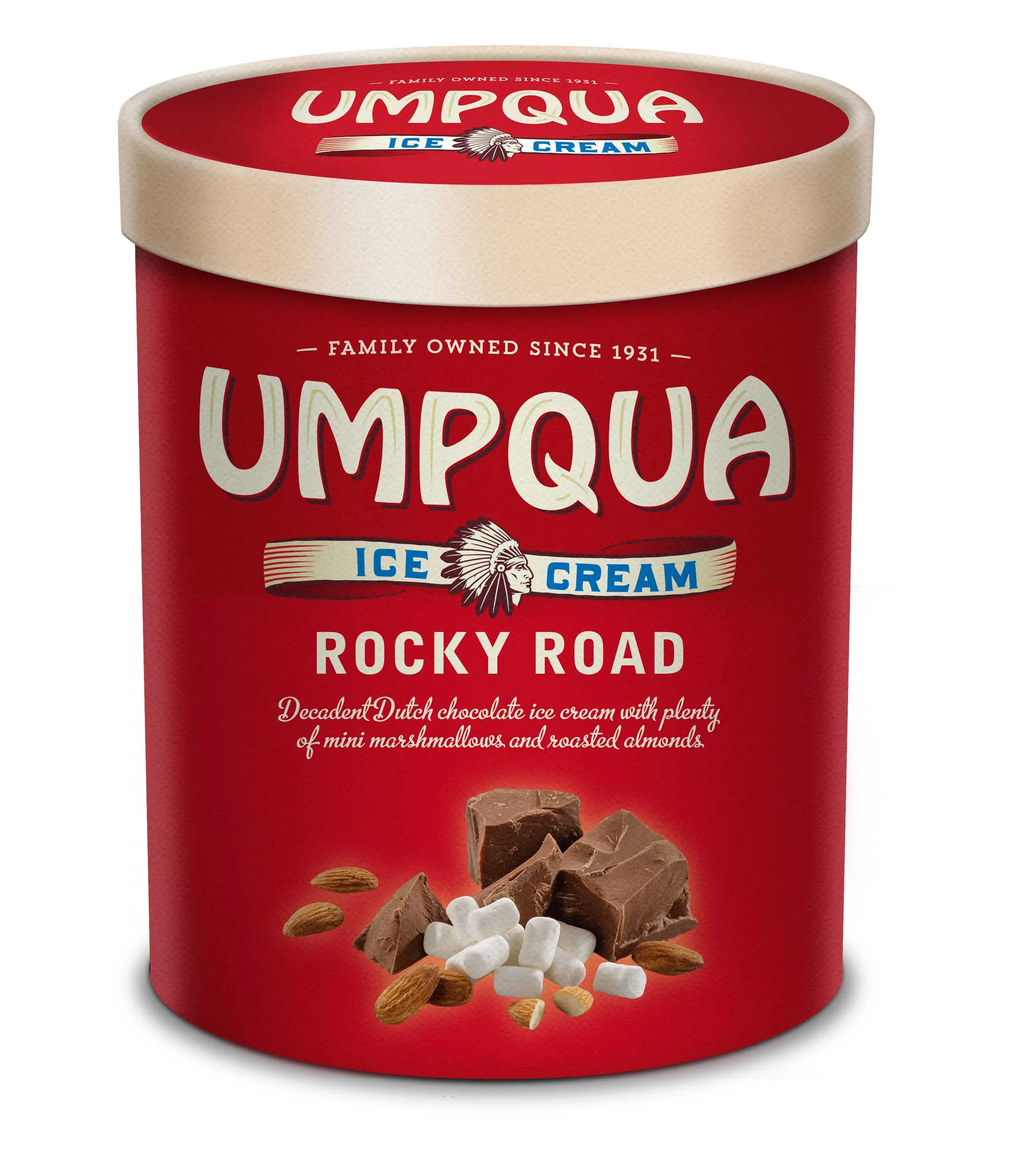
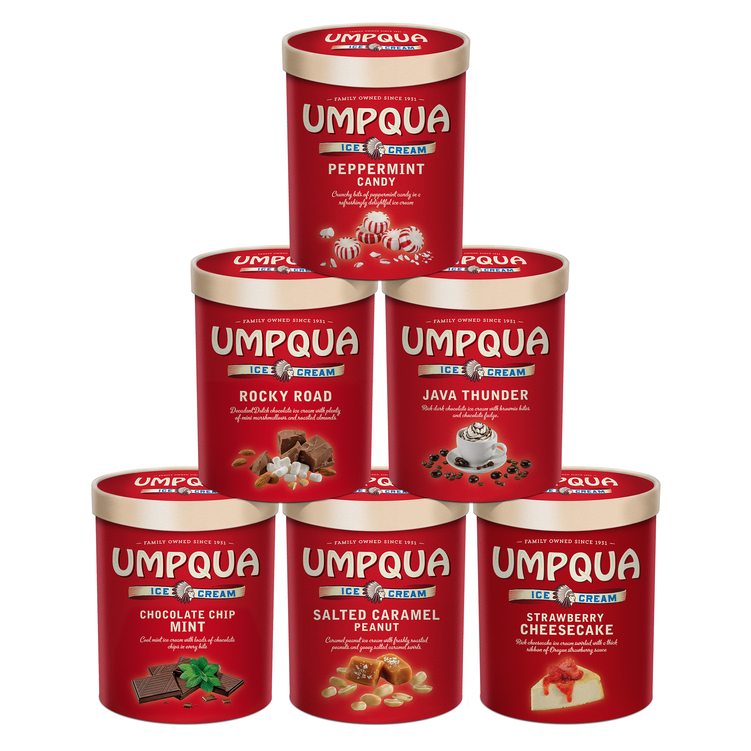
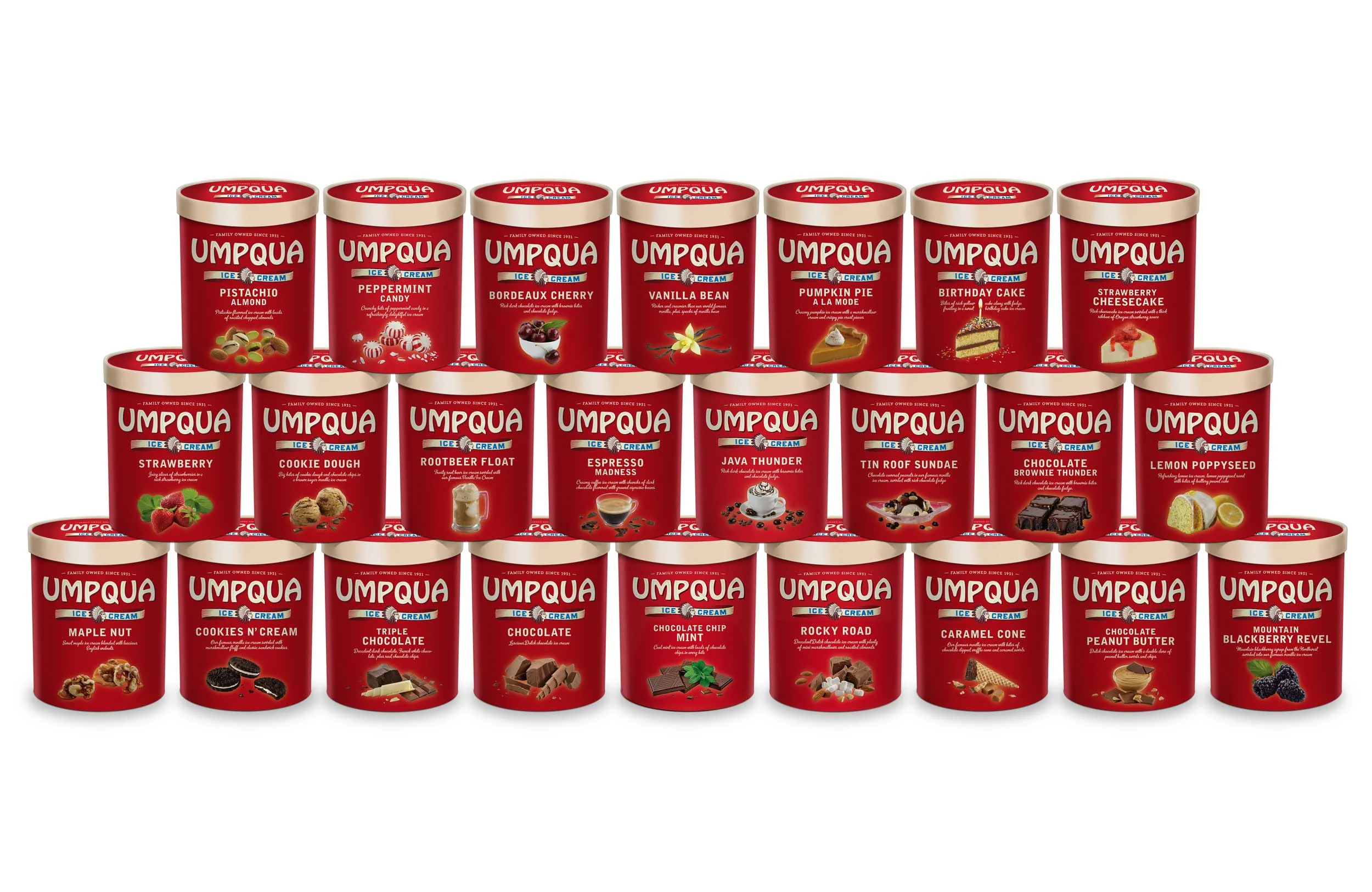
Deliverables: Logo, Illustration, Photography, Packaging

 The logotype was updated to include subtle highlights within the lettering and a drop shadow added for emphasis. The American Indian was redrawn to be proud and strong & integrated into the logo rather than as the only focus of the package.
UMP_TypeDetail_logo.png
UMP_RockyRoad.jpg
 For the first time, Umpqua now has flavor specific images on each carton to help consumers easily choose their favorite from 25 flavors.
UMP_26StackedCartons.jpg
UMP_CartonSidewalls_2500x1500.jpg
 To highlight Umpqua's long history, we dug through their archival images for storytelling on the sidewall of the container. 
 To add some playfulness to what was otherwise a graphically boring area next to the nutrition panel, we created some fun, nostalgic sayings based upon vintage ice cream advertising.